Featured Posts
Dots Per Inch and Pixels Per Inch, DPI and PPI respectively, are units for measuring the tiny bits of color that come together to form a printed image or an image on a screen. The higher the density of those dots or pixels, the higher the resolution. For most, a rudimentary understanding of DPI or PPI amounts to knowing whether or not an image is clear but small enough to print, email, or post to social media. However, for designers, understanding screen density and ratio is essential to delivering delightful user experiences across devices.

Heading

Under the hood, an Android app is just a collection of “activities” — each activity is normally a single screen in the app. Activities are connected using “intents”. For example, when you press a button in activity A, it can trigger an intent representing “launch activity B”. Sounds straightforward, right? What makes intents really powerful is:

  • Their ability to work across apps (like enhanced versions of custom URL schemes for native desktop and iOS apps)
  • They can be generally defined and even return information to the previous activity (e.g. “launch a photo-taking app and give me the photo”)

Subheading

For example, suppose you’re building a messaging app. It’s common to allow users to send images in these kinds of apps. Your first inclination might be to design a camera screen, along with a photo gallery picker, and possibly even a photo editor. Fortunately, intents make it so you don’t need to reinvent the wheel, and better yet, they give the user the choice to use whichever camera app, photo picker, or photo editing app they have installed.

Minor Heading

Designing for phones, tablets, laptops, watches, and hybrids without a proper knowledge of dpi and ratio is a lot like building a house using the wrong measurement — things are going to look very weird very quickly (and good luck getting through the door!).

Understanding the intricacies of PPI became essential when I started working on consistency for the Chrome team. In lieu of having a comprehensive guide to PPI and DPI, I had to learn on the job, making mistakes and experimenting along the way. After a year and a half of creating hundreds of assets across all the major mobile and desktop platforms, and receiving countless questions from other designers along the way, I realized I wasn’t alone in my struggle. So I decided to write down everything I knew. At first, I only intended to share my findings internally at Google, but the level of frustration among designers seemed so universal, I decided to publish it broadly. As it turns out, even I underestimated the demand. The resulting article, A Designer’s Guide to PPI and DPI, got over 80,000 hits its first month posted.

Typography

Type plays an immensely important role in Android and material design. Roboto is the default font family for Android, and includes a number of weights as well as a condensed variant. However, just like with iOS, you should incorporate your brand’s typographic palette into your app. Make sure to test your fonts on a couple of Android devices, since Android’s font layout engine and rasterizer are different from the one in OSX and iOS. Sometimes the same typeface will look better in one font format than another, so be sure to sample each OTF and TTF for the typeface. Finally, typography uses a slightly finer baseline grid of 4dp, so line heights should be 20dp, 24dp, 32dp, 36dp, etc.

So what’s different about Android?

Now that you know a little bit about material design, let’s talk about how Android is different from iOS and other platforms.
Use density-independent pixels (dp) and design in vector at 1x
On Android, the key unit of measure is the density-independent pixel, often abbreviated DIP or DP. If you’re coming from an iOS or web design background, DPs are essentially equivalent to points on iOS or CSS pixels. Measuring and sizing things in DPs ensures your designs have a consistent physical size across devices of varying density.

Surfaces & depth

iOS conventionally uses a blur effect to indicate depth, but you’ll want to focus on a considered use of elevated surfaces and shadows in Android. These qualities apply to objects in material design and help create a spatial model that will be consistently applied across apps.

Interaction & motion

Material design places a lot of emphasis on user-initiated motion and touch response. When you touch an element, in addition to the touch ripples that emanate from your finger, buttons can rise in elevation (essentially, their shadow grows) to “meet” your finger. This “magnetic” reaction is a departure from common touch feedback styles like color change or dimming on iOS and across the web. This magnetic reaction is authentically digital.

Designing and developing between platforms is a lot like traveling through different countries. You go through the same motions — sleeping, eating, sightseeing, regardless of where you are — but the customs of the country you’re visiting dictate how you go about doing them. In some countries, it’s ok to push people into the train, or eat a burger with a knife and fork. Similarly, if you developed your product first for iOS, you shouldn’t simply expect that you can port it into Android without issue, because your app will feel lost in translation. It’s important to understand the idioms and behaviors of each platform before you start design and development. That way your users will be able to use and easily understand your app on the platform that is native to them, and you will have the most clear and true version of your product — no matter where it’s used. This guide will walk you through some practical tips for moving from iOS to Android (and back again) without suffering a cultural divide.
It’s important to understand the idioms and behaviors of each platform before you start design and development.

Get acquainted with material design

Material design is a new approach to cross-product, cross-platform design that uses tangible surfaces, bold graphic design, and meaningful motion to help define the way software should behave. It is also the default visual language for Android 5.0+ devices, so learning the principles of the system will hugely benefit your project no matter where you start developing.

Material design offers a system for designing functional and elegant software. 

How does your brand fit into the framework? We’ve created a step-by-step guide to staying on-brand while going material.
Nobody knows your brand better than you do. This is why when we set out to create the framework for material design, we were sensitive to the ways in which third-party developers might leverage the system.

We wanted material design to give comprehensive guidance for designing effective and elegant UIs — taking a strong position on motion, dimensionality, color, and graphic hierarchy — but with enough latitude to allow for various levels of engagement. You don’t have to adopt every element of the material design system in order for it to be beneficial to your identity system.
Whether it’s a custom font, a unique color story, or distinct voice, everything that provides stylistic distinction in a product should be celebrated and supported in the material design framework. We’ve laid out the top brand touchpoints to help illustrate the system’s flexibility and give designers and developers a road map for showcasing their brand identity.


Color Correct

Color is one of the most important elements of your brand identity. Just think of the blue in Facebook or the black and white theme in UBER. If you’ve developed a strong color story for your brand, stick with it. There is nothing more disorienting to a user then suddenly feeling like he or she has entered a different product space in the UI. Material design provides a simple, smart approach to building harmonious color stories, regardless of whether you use the palette or apply your own color story to the system. The key is the way in which color is applied to the UI.

The material design palette, for example, starts with the primary 500s and scales from light to dark, offering a variety of carefully chosen values. The 500s are perfect for describing the dominant theme for your brand and are great for large areas of color, like backgrounds and status bars. From there, you can choose a supporting value, scaling up to a 700 for system bars, for example, or down to a 300 for secondary information. Accent colors are brighter and more saturated. They encourage user interaction by popping off the screen and contrasting with the rest of the palette. They are perfect for fabs, buttons, switches, and sliders.


You can easily use this system with your own brand color, scaling different elements in the UI to be darker and lighter based on their importance and use. Choosing a nice contrasting accent color for primary call-to-action elements in the UI, like FABs. For content-rich brands that surface a lot of color through imagery or use color extraction, consider using a more neutral or subtle color theme within your UI.

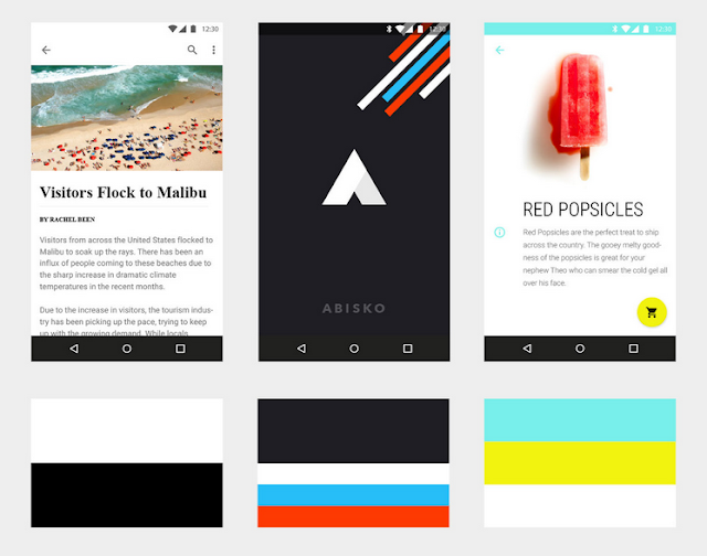
Despite not having colors in its brand identity, The Fortnightly uses the strong juxtaposition of black and white to create hierarchy and contrast. The color within this product comes from the content. Abisko’s main canvas color and the primary color is dark gray, which creates contrast with the brighter and more colorful supplementary colors appearing throughout the UI in the form of graphic treatments and UI elements. Shrine’s palette consists of two accent colors. Although the app features two bright accents, the colors are used judiciously to create a nice, balanced contrast with the white canvas.

We challenged ourselves to create a visual language for our users that synthesizes the classic principles of good design with the innovation and possibility of technology and science. This is material design. This spec is a living document that will be updated as we continue to develop the tenets and specifics of material design.
Motion respects and reinforces the user as the prime mover. Primary user actions are inflection points that initiate motion, transforming the whole design.

All action takes place in a single environment. Objects are presented to the user without breaking the continuity of experience even as they transform and reorganize.
Motion is meaningful and appropriate, serving to focus attention and maintain continuity. Feedback is subtle yet clear. Transitions are efficient yet coherent.

The foundational elements of print-based design—typography, grids, space, scale, color, and use of imagery—guide visual treatments. These elements do far more than please the eye. They create hierarchy, meaning, and focus. Deliberate color choices, edge-to-edge imagery, large-scale typography, and intentional white space create a bold and graphic interface that immerse the user in the experience.

An emphasis on user actions makes core functionality immediately apparent and provides waypoints for the user.

Recognizing the best-in-class designs from around the community.

Google revealed the material design system to the world one year ago at Google I/O 2014. Since then, our Material UX team has watched excitedly as designers and developers have begun to implement our guidelines across platforms and products, delivering material experiences to millions of users. While we are delighted and humbled by the positive reception, we recognize that good design is never done, and we are committed to expanding and improving the system based on feedback from our community of makers.
In that spirit, we want to recognize the individuals, teams and companies that have made the promise of material design that much more of a reality with our first-ever Material Design Awards. The Material Design Awards encourage and recognize excellence in applying material design in the creation of engaging user experiences, and are highlighted in a collection on the Google Play store. The six winners honored at this year’s Google I/O conference represent best-in-class applications of specific aspects of material design.