Showing posts with label Blog. Show all posts

Surfaces & depth

iOS conventionally uses a blur effect to indicate depth, but you’ll want to focus on a considered use of elevated surfaces and shadows in Android. These qualities apply to objects in material design and help create a spatial model that will be consistently applied across apps.

Interaction & motion

Material design places a lot of emphasis on user-initiated motion and touch response. When you touch an element, in addition to the touch ripples that emanate from your finger, buttons can rise in elevation (essentially, their shadow grows) to “meet” your finger. This “magnetic” reaction is a departure from common touch feedback styles like color change or dimming on iOS and across the web. This magnetic reaction is authentically digital.

Designing and developing between platforms is a lot like traveling through different countries. You go through the same motions — sleeping, eating, sightseeing, regardless of where you are — but the customs of the country you’re visiting dictate how you go about doing them. In some countries, it’s ok to push people into the train, or eat a burger with a knife and fork. Similarly, if you developed your product first for iOS, you shouldn’t simply expect that you can port it into Android without issue, because your app will feel lost in translation. It’s important to understand the idioms and behaviors of each platform before you start design and development. That way your users will be able to use and easily understand your app on the platform that is native to them, and you will have the most clear and true version of your product — no matter where it’s used. This guide will walk you through some practical tips for moving from iOS to Android (and back again) without suffering a cultural divide.
It’s important to understand the idioms and behaviors of each platform before you start design and development.

Get acquainted with material design

Material design is a new approach to cross-product, cross-platform design that uses tangible surfaces, bold graphic design, and meaningful motion to help define the way software should behave. It is also the default visual language for Android 5.0+ devices, so learning the principles of the system will hugely benefit your project no matter where you start developing.

Material design offers a system for designing functional and elegant software. 

How does your brand fit into the framework? We’ve created a step-by-step guide to staying on-brand while going material.
Nobody knows your brand better than you do. This is why when we set out to create the framework for material design, we were sensitive to the ways in which third-party developers might leverage the system.

We wanted material design to give comprehensive guidance for designing effective and elegant UIs — taking a strong position on motion, dimensionality, color, and graphic hierarchy — but with enough latitude to allow for various levels of engagement. You don’t have to adopt every element of the material design system in order for it to be beneficial to your identity system.
Whether it’s a custom font, a unique color story, or distinct voice, everything that provides stylistic distinction in a product should be celebrated and supported in the material design framework. We’ve laid out the top brand touchpoints to help illustrate the system’s flexibility and give designers and developers a road map for showcasing their brand identity.


Color Correct

Color is one of the most important elements of your brand identity. Just think of the blue in Facebook or the black and white theme in UBER. If you’ve developed a strong color story for your brand, stick with it. There is nothing more disorienting to a user then suddenly feeling like he or she has entered a different product space in the UI. Material design provides a simple, smart approach to building harmonious color stories, regardless of whether you use the palette or apply your own color story to the system. The key is the way in which color is applied to the UI.

The material design palette, for example, starts with the primary 500s and scales from light to dark, offering a variety of carefully chosen values. The 500s are perfect for describing the dominant theme for your brand and are great for large areas of color, like backgrounds and status bars. From there, you can choose a supporting value, scaling up to a 700 for system bars, for example, or down to a 300 for secondary information. Accent colors are brighter and more saturated. They encourage user interaction by popping off the screen and contrasting with the rest of the palette. They are perfect for fabs, buttons, switches, and sliders.


You can easily use this system with your own brand color, scaling different elements in the UI to be darker and lighter based on their importance and use. Choosing a nice contrasting accent color for primary call-to-action elements in the UI, like FABs. For content-rich brands that surface a lot of color through imagery or use color extraction, consider using a more neutral or subtle color theme within your UI.

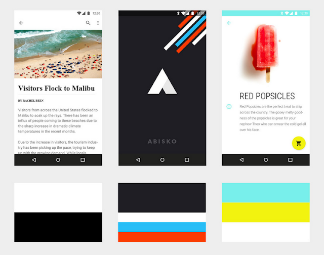
Despite not having colors in its brand identity, The Fortnightly uses the strong juxtaposition of black and white to create hierarchy and contrast. The color within this product comes from the content. Abisko’s main canvas color and the primary color is dark gray, which creates contrast with the brighter and more colorful supplementary colors appearing throughout the UI in the form of graphic treatments and UI elements. Shrine’s palette consists of two accent colors. Although the app features two bright accents, the colors are used judiciously to create a nice, balanced contrast with the white canvas.

Recognizing the best-in-class designs from around the community.

Google revealed the material design system to the world one year ago at Google I/O 2014. Since then, our Material UX team has watched excitedly as designers and developers have begun to implement our guidelines across platforms and products, delivering material experiences to millions of users. While we are delighted and humbled by the positive reception, we recognize that good design is never done, and we are committed to expanding and improving the system based on feedback from our community of makers.
In that spirit, we want to recognize the individuals, teams and companies that have made the promise of material design that much more of a reality with our first-ever Material Design Awards. The Material Design Awards encourage and recognize excellence in applying material design in the creation of engaging user experiences, and are highlighted in a collection on the Google Play store. The six winners honored at this year’s Google I/O conference represent best-in-class applications of specific aspects of material design.